Style guide - CTA blocks
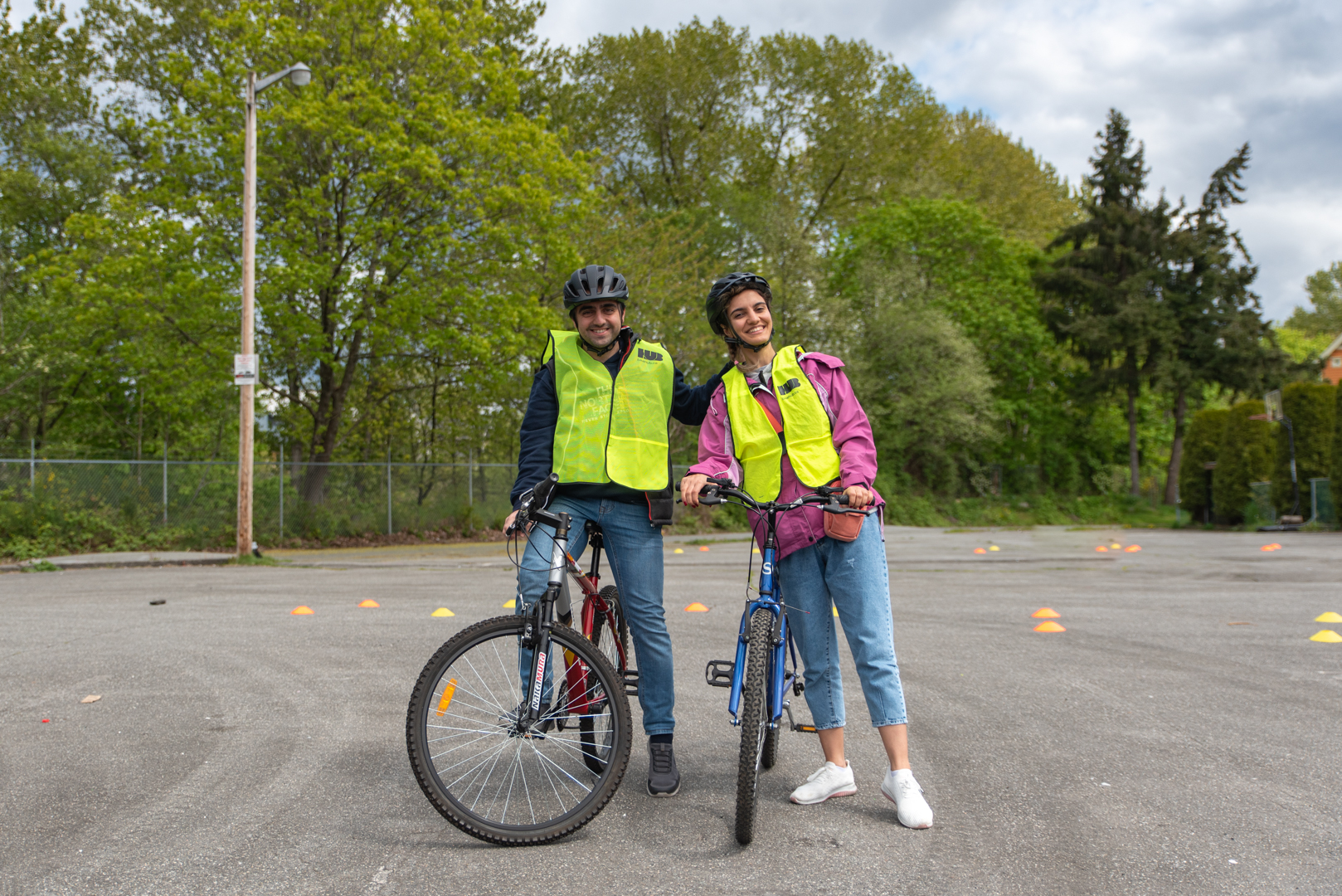
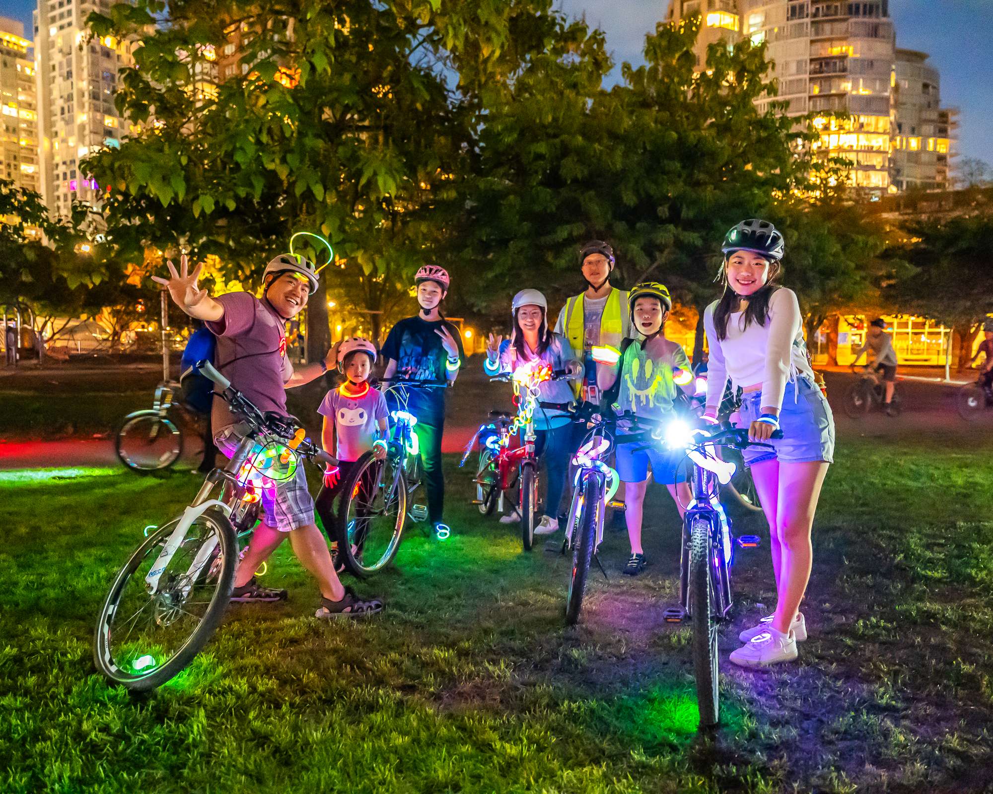
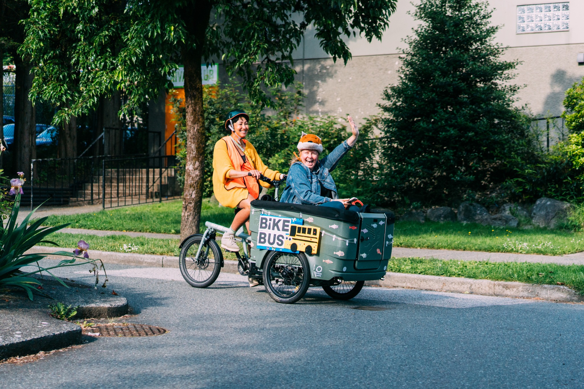
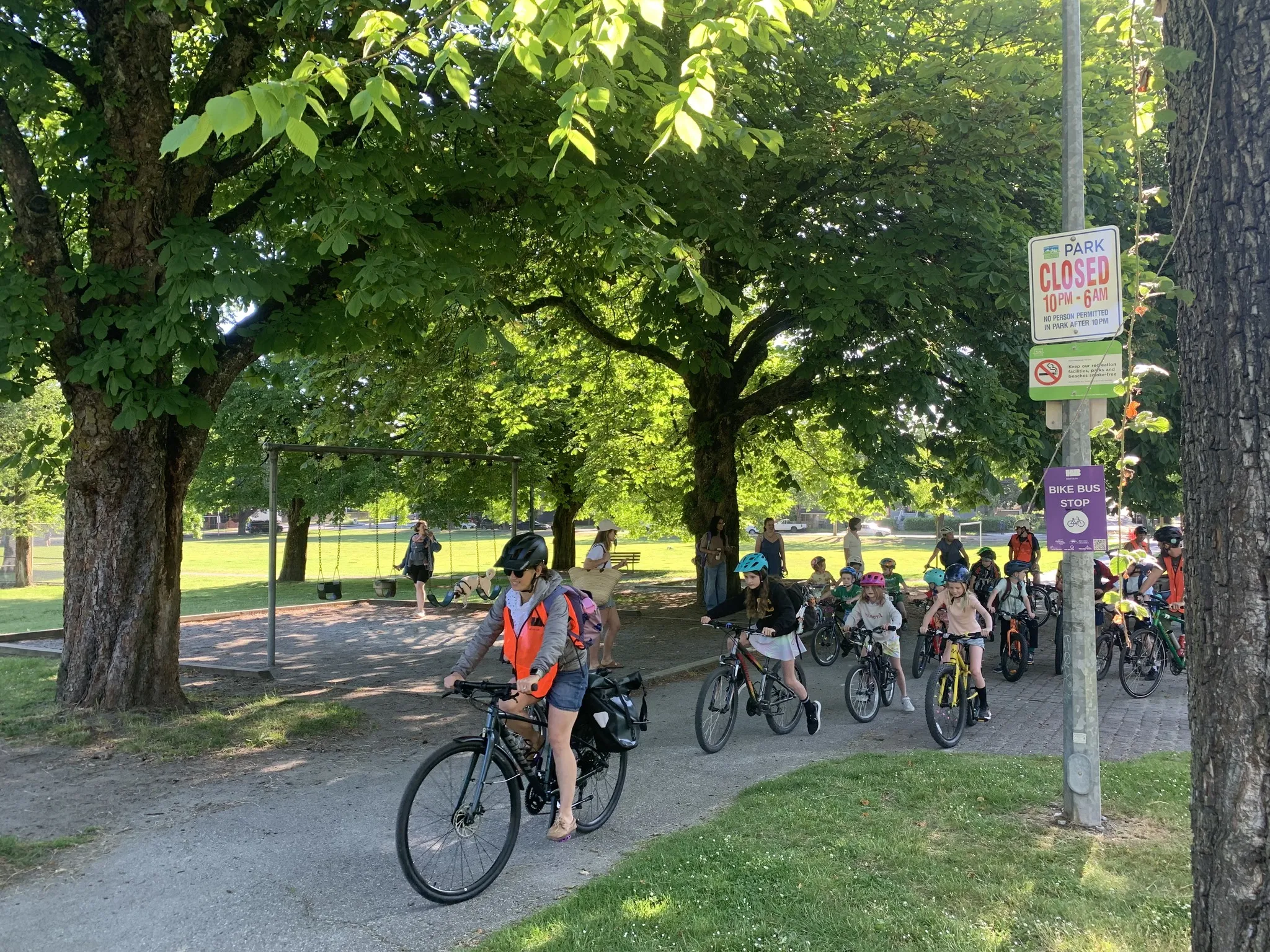
This is a hero block
You can select the three images from the media library (or upload new ones).
This is an image CTA block
There are a few options within this block. This is the default with image on the right.
You can add up to two buttons below for you call to action.
Useful for linking to events or other featured news.

Image CTA Block with image on left
You can set the image side with the image position dropdown.
You can also set the background style - grey (as in this case) or a gradient.
If you choose to add a video, it will play in an overlay. (click image to see)

This is also an Image CTA set to 70/30
There are some 70/30 blocks in the design.
You can make these blocks that style by selecting the block style option.
Last image cta style is a special snowflake
This style is used for the bottom 'get involved' block on every page.
But it's available to be used on any page. Select the "showcase" style from the block drop down.
You will also want to select the 'gradient' background to full match the design on this block.

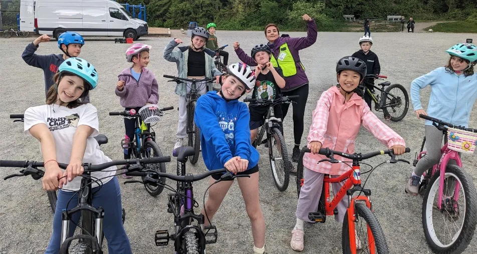
This is a Feature CTA Block
Another call to action block from the design. A bit smaller than the image cta block but centred in the page nicely.
Up to two button options.
Image cards block - Simple card CTA's - can be links
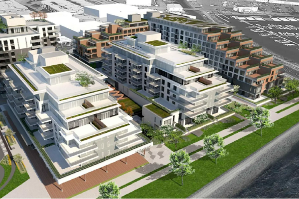
Harbourside Case Study
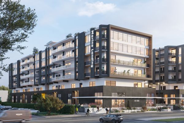
Marine Landing Case Study

Bentall Center Case Study
Heading block
You can use a heading block as a header for a section below, or as a more text based cta.
You can optionally display just the title, just the text, just a button or just social media links; or some combination.
The title and text are centred.
The Stay Connected block at the bottom of this page is a heading block saved as a 'persistent content block'
Webform block
- Option to be two column (on desktop) or single colmn.
- Paste the Keela form embed code to display the form.
- Also an option to select a Drupal webform if you choose to use them in the future.